
If you’ve used the PHOTO2PRINT Online Design Tool recently, you may have noticed some welcome changes. The latest update, version 2026r2.3, brings three new features to the editor, each one designed to remove a small frustration from the design process and give you more creative freedom while you work.
Let’s walk through what’s new.
1. Remove Backgrounds Directly in the Editor
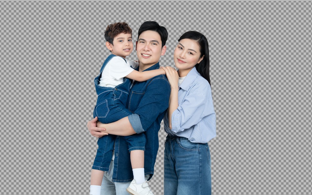
This is the headline feature, and for good reason. You can now remove the background from any photo directly inside the Online Design Tool with no additional software required.
Until now, if you wanted to isolate a subject from a cluttered or distracting background, you’d have to do it beforehand using a separate photo-editing application, save the result, and then import it into your photobook project. It was an extra step that interrupted the creative flow, and for many people it was simply a barrier they didn’t bother crossing.
That barrier is gone. The Remove Background feature is built right into the editor, meaning you can make that adjustment on the spot, in the same place you’re designing your pages.

Why would you use it?
The applications are broader than you might think. The obvious use case is portraits, removing a busy or distracting background from a photo of a person so that they become the clear focus of the image. But it works just as well for pets, for isolating a special object (think a close-up of a birthday cake, a piece of jewellery, or a flower), or simply for creating a cleaner, more graphic layout on the page.
Once the background has been removed, the subject can be placed over a solid colour, a textured background, or worked into a creative design alongside other elements on the page. It opens up a whole new category of layouts that simply weren’t practical before.
Whether you’re building a family photobook, a wedding album, or a keepsake for someone special, this feature gives you more ways to make your favourite photos look their absolute best, without ever leaving the editor.
2. The Text Editor Now Remembers Your Style
Here’s something that will feel immediately familiar to anyone who has ever added captions to a multi-page photobook: the repetitive process of setting up your font, size, and text style every single time you add a new text box.
Choose your font. Set the size. Pick the colour. Now do it again on the next page. And the page after that.
The latest update puts an end to this. The Text Editor now remembers the text style you were using previously, and automatically applies those same settings when you open a new empty text box. Your font, size, colour, and formatting choices carry over so the next caption or heading you add picks up right where the last one left off.

This might sound like a small thing, but in practice it changes the rhythm of designing a photobook considerably. Instead of constantly reaching back to the text toolbar to re-establish your settings, you can focus on what actually matters: what the text says, and how it fits with the photos around it.
It’s particularly valuable for long projects. If you’re working on a 60-page wedding album or a detailed year-in-review book, maintaining consistency across dozens of text boxes used to require constant attention. Now the editor does that work for you in the background, keeping your fonts and styles aligned throughout the entire book without any extra effort on your part.
3. Recently Used Colours Are Always Close to Hand
The third new feature follows a similar philosophy: less time hunting, more time designing.
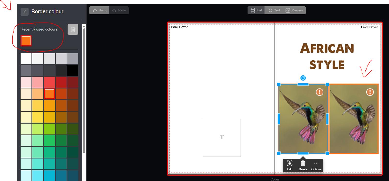
When you select a colour for text, backgrounds, or decorative elements in your photobook, that colour is now saved in the colour menu under a “Recently Used” section. The next time you open the colour picker, your recent choices are right there at the top. No need to re-enter a hex code, scroll through a colour wheel, or try to remember exactly which shade of navy you used on page three.
This is especially useful when you’re working to a specific colour theme. Many people approach photobook design with a palette in mind. Perhaps to match a wedding colour scheme, a seasonal mood, or a brand identity for a professional project. Keeping that palette consistent across backgrounds, text, borders, and other elements used to mean a lot of back-and-forth with the colour picker. The Recently Used Colours feature eliminates that friction entirely.
Your chosen colours are simply there when you need them, making it far easier to keep your pages looking coordinated, considered, and professionally designed from cover to cover.

Small Features, Real Impact
It’s worth stepping back and looking at what these three updates have in common. None of them change what you can fundamentally create with the Online Design Tool. Instead, they each remove a specific point of friction that was getting between you and the finished photobook.
Removing the background editing barrier. Eliminating repetitive text formatting. Keeping your colours within easy reach. Together, they add up to a meaningfully smoother design experience — one where the tool gets out of your way and lets you concentrate on the memories you’re trying to preserve.
Log in to your PHOTO2PRINT account and try them out. Your next photobook just got a little easier to make.